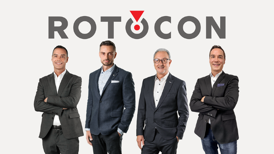
ROTOCON, a leader in label printing and finishing technologies, has revealed a new corporate identity that includes a modernized logo and an updated website set to launch in early 2026. The redesign reflects ROTOCON’s expanding international presence and its continued innovation in the narrow-web printing space. Featuring a contemporary typeface, the updated wordmark includes a clean-cut “R” and refined symmetrical “O”s, symbolizing the technical precision the company is known for. The signature red mark remains central—now balanced to convey both continuity and progress.
“The updated design better reflects our international footprint and the engineering capabilities we continue to advance globally,” stated the ROTOCON Board of Directors. The forthcoming website will feature improved navigation, faster resource access, and dynamic visuals to enhance the user experience. As the industry evolves, ROTOCON's refreshed identity underscores its ongoing mission to deliver reliable technology and nurture global partnerships.

Proofed (Human)

Listen to This Article

Loading...

Login
New User? Signup
Reset Password
Signup
Existing User? Login here
Login here
Reset Password
Please enter your registered email address. You will recieve a link to reset your password via email.
New User? Signup
Currency Exchange Graph