...not doing the printers of the world a big favor by stating this to be “The new normal” in color reference management.
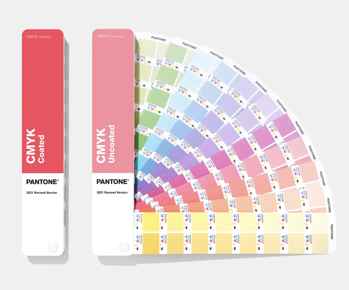
As most of you know and probably use yourselves, Pantone is one of the market leaders and world widely recognized as the color reference guide used by many print professionals, brand owners, designers and print buyers to communicate & specify their (brand) colors to their print producer, the printer or printshop.
There is a significant cost invested in the careful design and color schemes of their products and they of course want to see this accurately printed & represented in their final printed products.
No news here one would say…,
…only every printshop or printer knows the hassle and the tough discussions they had or have now and then with their customers when the final result - after production printing - is compared to the (local) color guide the customer/designer holds, to which they compare the result.
You both use the same color Pantone reference guide, right? it’s in the book.
How many times does the phone ring to hear that in the customers opinion there is a too big of color difference to their color guide in hand and that it is unexpected, and they want a “commercial compensation” or else a reprint? Sound familiar? Hopefully not too often.
Where can the problem lie, we are both using the Pantone CMYK color guide, preferably no older than 18 months as recommended. To my mind and by offering the new CMYK guide claiming that their new color guides are within the very narrow tolerances of less than 2 dE2000 for each color, Pantone is virtually creating a nearly impossible vacuum for printers to deliver correct and DISCUSSION FREE print production work.
Back in 2018 already, the independent blog insights4print.ceo (Eddy Hagen) wrote a striking piece “Your Color Guide and You: first results” (https://www.insights4print.ceo/2018/11/your-color-guide-and-you-first-results/), already emphasizing on the problem of higher color deviations out of the announced tolerances that Pantone claims to handle.
A couple of days ago, I discussed this New 2021 offering of Pantone’s new CMYK color guide, the claims and their statements about it with Insights4print.ceo (who also wrote another blog article about this 2021 edition), and leaving us both a bit flabbergasted where this will leave many of our print shops and printers in the color discussion.
It even must remain seen what the real deviations are Pantone has been able to produce themselves for their newly produced and printed 2021 CMYK color guides. They are being commercialized as of now according to their website.
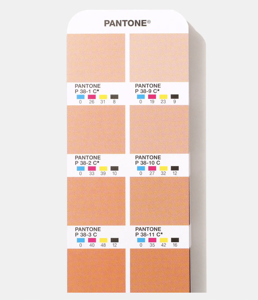
Pantone’s website states: ( https://www.pantone.com/cmyk-guide-coated-uncoated ) “Pantone’s refreshed CMYK Guide contains a whopping 2,868 CMYK colors, chromatically arranged for more intuitive color browsing and selection. Colors are marked to identify which colors have a PMS Formula Guide equivalent colors. Those colors without an asterisk are unique, meaning they don’t have a close Pantone Matching System (PMS) spot color equivalent. These colors are ideal for branding, packaging, and materials used in smaller brand campaigns where fresh, less exposed colors are desired. Each book contains thousands of unique colors with no PMS equivalent. New CMYK Guides are now calibrated to exacting G7 specifications for more accurate, consistently achievable results in real world printing conditions. The G7 calibrated print process means tints will closely match color appearance in your CMYK Guide when proofed or printed using G7 press reference conditions.”
• 2,868 CMYK colors, 700 more than other PMS Guides!
• 1,879 coated unique colors and 1,653 uncoated unique colors with no Pantone spot color equivalent less than 2.0 Delta E 2000.
This seems to imply that these “new” colors of the 2021 CMYK edition (GP5101B) are somewhere in between the colors of the last CMYK color guide edition (GP5101) and that they are LESS than 2 dE2000 apart!
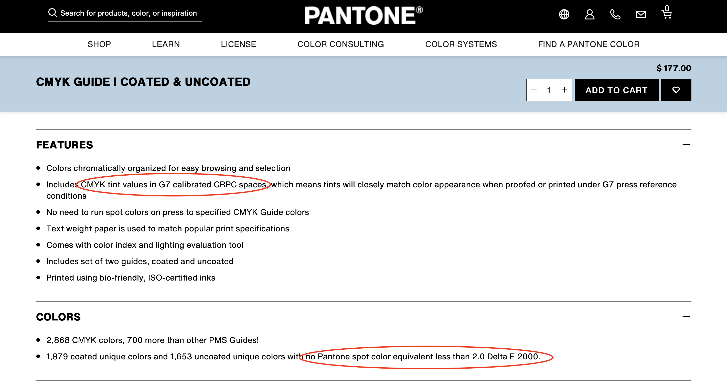
In my opinion and also by blog insights4print.ceo this is an outrageous claim because not only the G7 colourspace standard does with higher tolerances (up to 3,5 dE00), it also doesn’t define “the direction” of this tolerance in up or down, so it can be in plus or minus within G7.

Thu October 5th
Webinar: Wanneer is het...
Prindustry Online Kennissessie 14 november 2023
Tue February 21st
Countdown naar Sign & P...
DRIE DAGEN VOL INSPIRATIE EN ONTMOETINGEN
Sat February 4th
VIGC / BOPE goes ORANGE...
5e editie van het Benelux Online Print Event, platform voor iedereen die met online printen te maken heeft.
Fri December 23rd
GGZ Friesland standaard...
Inge Postma en Marco Kuipers automatiseerden de communicatieprocessen van GGZ Friesland met de Prindustry Brandportal.
Mon October 24th
BOPE23 - VIGC 2023 geli...
BOPE23 - VIGC 2023 gelijktijdig met Sign & Print Expo in Gorinchem (NL). Save the date.
Wed March 30th
Online Kennissessie: Br...
Prindustry webinar op 10 mei 2022 voor grafisch ondernemers. Naar een compleet communicatieproces voor je klanten, inclusief IT oplossing.
Wed December 22nd
Prindustry behaalt ISO ...
Prindustry heeft in 2021 hard gewerkt aan het binnenhalen van een mooi certificaat: de ISO 27001.
Mon October 25th
Kennissessie over white...
30 november live op het Prindustry kantoor
Fri October 15th
Tal van bewijzen van...
Wat de kranten zeggen-Week van 11 oktober-Door Nessan Cleary
Fri October 8th
Australië voelt nog ...
Wat de kranten zeggen-Week van 4 oktober-Door Nessan Cleary
Schrijf je in
Ontvang een melding om u in te schrijven op onze nieuwsbrief
Login
Nieuwe gebruiker? Meld je aan
Reset paswoord
Meld je aan
Bestaande gebruiker? Meld je hier aan
Meld je hier aan
Reset paswoord
Voer uw geregistreerde e-mailadres in. U ontvangt een link om uw wachtwoord opnieuw in te stellen via e-mail.
Nieuwe gebruiker? Meld je aan